The Plot Graph
To better show you how I felt a book, I've added the plot graph (any suggestions for a cooler name?)
It (sort of) maps out the events of a book and how interesting they were. It's in no way accurate, it doesn't follow chapters or pages (= a dot is not a chapter, it's a happening. That happening could be something huge like a death or a proposal or just a sentence that for me meant something big)
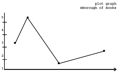 In the above graph you can see the 5 different zones.
On the actual reviews I won't be including the numbers nor an explanation of the graph, because I don't want this to be super strict. It's merely just about getting a feel of it.
EDIT: on further thought, I should also mention that most good books will hover around 3 and 4, peeking into 5 for the really good bits.
It (sort of) maps out the events of a book and how interesting they were. It's in no way accurate, it doesn't follow chapters or pages (= a dot is not a chapter, it's a happening. That happening could be something huge like a death or a proposal or just a sentence that for me meant something big)
- is basically boring or bad
- that state where it could go either way
- is quite decent
- is pretty good
- is so awesome you can't put it down
On the actual reviews I won't be including the numbers nor an explanation of the graph, because I don't want this to be super strict. It's merely just about getting a feel of it.
EDIT: on further thought, I should also mention that most good books will hover around 3 and 4, peeking into 5 for the really good bits.
Love this idea! It appeals to my inner mathematician :)
SvarSlet@Sam - :D thanks!
SvarSlet